Ilona Chadwick's blog for Geography

Friday, November 26, 2010

Amur Leopard Habitat Project


More Information on the Amur Leopard at Wikipedia

Conservation Information on the Amur Leopard at The Amur Leopard and Tiger Alliance Website

Abstract

The critically endangered Amur Leopard's habitat in Primorsky Krai, Russia, is being destroyed by fires. Frequent ground fires are converting the leopard's preferred habitat, dense forest, into grasslands. This study employs a comparison of Landsat images using NDVI analysis, fire data from FIRMS, SRTM data, and night light data to examine fire extent and forest loss. The images clearly show that deforestation is occurring in the area, and the fires and loss of greenness are concentrated near human settlements. This reinforces the theory that locals may be causing or encouraging fires either deliberately or indirectly by converting forests into more easily burned hayfields. Educating the locals on the importance of wildlife conservation, as well as creating fire breaks to slow the spread of fires in leopard habitat, should help conservation efforts.


Introduction

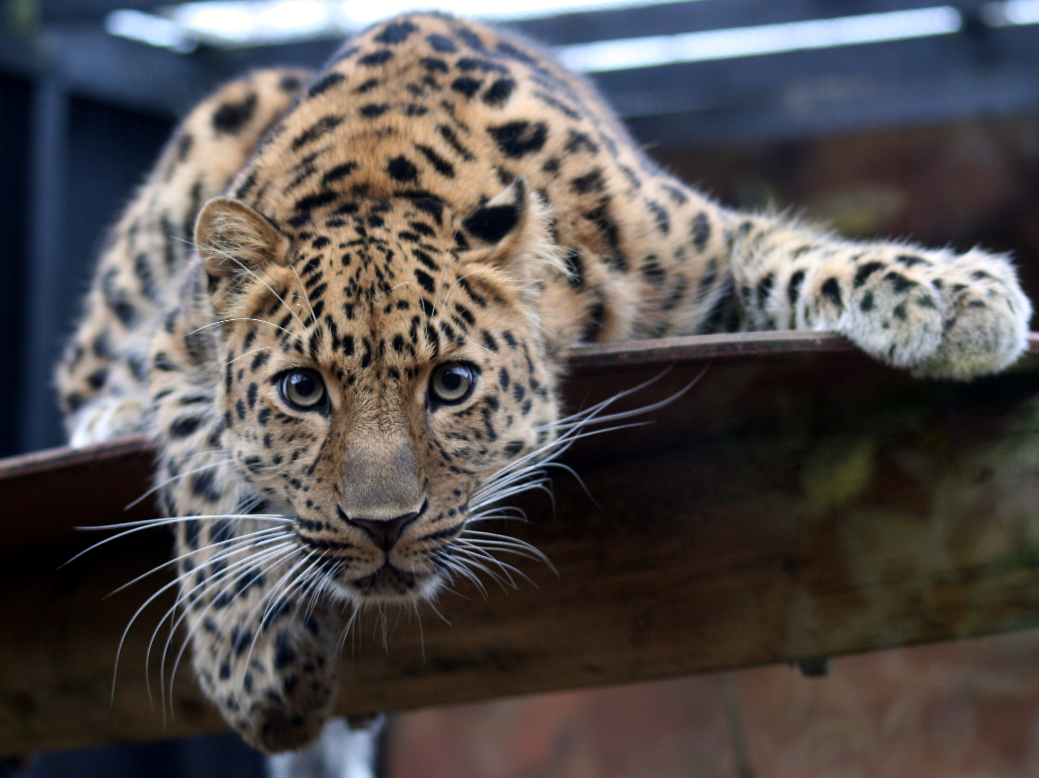
In far-eastern Russia, along the Pacific coast, is a biodiversity hotspot called Primorsky Krai (spelling variations include Primorskii, Primorskiy, and Primorye Kray). This area is home to the critically endangered Panthera pardus orientalis, also known as the Amur Leopard or Far Eastern Leopard. No more than thirty of the cats currently survive in the wild, and the small population urgently needs protection. One of the main threats to the survival of these cats, along with poaching and human development, is the destruction of their habitat by fires. Amur Leopards require dense forest habitat, but frequent fires turn the forests into grasslands. Locals are thought to encourage burning because ferns that are valuable as a cooking ingredient prosper in the open grassland environment. The most prominent research on this phenomenon was undertaken by ALTA (The Amur Leopard and Tiger Alliance). ALTA’s paper examines the extent of fires in Primorsky Krai, and finds a correlation between high fire occurrence and areas of human activity. To build upon ALTA’s research, additional analyses of satellite images were conducted. The intent is to determine the extent to which the fires have damaged the landscape, and the loss of tree-cover in the Primorsky Krai area.

Methods

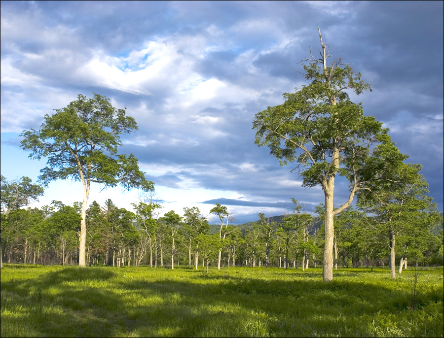
The study area is the southwestern tip of the Primorsky Krai region of Russia, along the border with North Korea and China. This coastal region spans from about 44°N, 130°E to 42°N, 132°E. The diverse flora of the region includes tundra, coniferous-deciduous forest, and forest-steppe or grassland. While some of the oak trees are able to withstand small fires, the fires in the area have become too frequent for even the most resilient trees to survive. To examine the conversion of forest to grassland in Southwestern Primorsky Krai, several data sets are used. A time-series obtained from the FIRMS Web Fire Mapper shows all of the fires that have burned in the area from 2000 to 2010. Landsat images from 1976 and 2007 were processed by applying an NDVI to red-IR coded images, and a density slice was applied to show the results in color. SRTM elevation data were downloaded from the GLCF and can be used to evaluate the terrain. A 3D model of elevation in the area shows the shape of the coast-line. Comparisons over time are made to determine the extent of loss of forest cover.

The study area of the Landsat images and SRTM data:


View Primorsky Krai in a larger map


Results

Overall, it appears that there are a large number of forest fires in the area, and closed forest is transitioning into open grassland, which is unsuitable habitat for the Amur Leopard. Analysis of the NDVI's of the Landsat images shows that greenness (photosynthetic activity) has decreased in various areas within the study site. The areas where greenness has decreased correlate with lighter areas in the night-light image, indicating that deforestation is taking place mostly near human settlements (near the coast). Comparison with the FIRMS fire data also shows that the areas that show a loss of greenness tend to be more frequently burned than other areas. These findings are particularly disturbing when it is considered that most of the Landsat study area is within the Barsovyi Wildlife Refuge. Although the fires may not be large and destructive, their frequency prevents the forest understory from regrowing, leading to a gradual transition to grassland as the trees die out.

Imagery

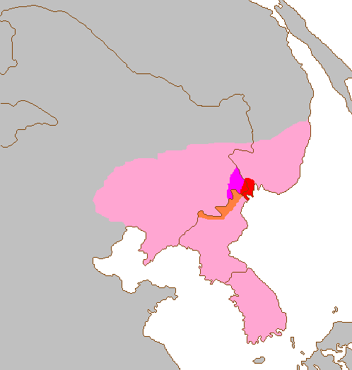
The following images are of the South-western tip of the Primorsky Krai region of Russia, where the few remaining Amur Leopards reside. Click the images for a larger view. The first map shows the Amur Leopard's historic distribution (pink) and the area it is currently restricted to (red). The area covered in subsequent images is within the red section of this image:


Source: Wikipedia

A subset of a 1976 Landsat image of the area:


A subset of a 2007 Landsat image of the area:


An NDVI of the 1976 Landsat image:


An NDVI of the 2007 Landsat image:


Colors, from highest to lowest NDVI Values (applies to both NDVI images)
Light green: highest NDVI value
Dark Green
Yellow
Orange
Red
Light Blue
Dark Blue: lowest NDVI value

The 2007 Landsat NDVI again. The circled areas are areas that appear significantly different from the 1976 image, and indicate possible burn scars, areas of deforestation, or areas where human settlement or agriculture has been expanded:


SRTM 90 meter resolution elevation image for the area:


A 3D Surface View of the SRTM 90 meter elevation image. A notable crevasse is visible in the western portion of the image, which shows up as a low-vegetation area in the Landsat images:


Night Light Image of the area, which roughly indicates where human settlements are:


A slideshow of fires in the area from 2001 to 2010, from the FIRMS Web Fire Mapper. Protected areas are marked in green, and orange squares mark where fires occurred. These images cover a larger area than the Landsat and SRTM.


Discussion

These findings reinforce those of ALTA's research in the area. ALTA found that areas already affected by human activity (meadows and hayfields) were much more likely to burn than other areas. This correlation between areas of human activity and higher frequency burning is clearly visible in the FIRMS slideshow.

There are limitations to this research. For example, the 1976 Landsat image is much lower quality than the 2007 image, which made them difficult to compare. There were also a few clouds in the 2007 image which can affect the analysis.

Additional research in this area is needed. Although greenness is a good measure of vegetation cover, higher resolution imagery could be analyzed to clearly distinguish forested areas from open grasslands. Analysis of forest cover could definitively show where deforestation and leopard habitat loss has occurred. ALTA also mentions that the border patrol in the area has acted as an effective fire break which stopped fires from spreading across the border zone. Part of their efforts involve creating more fire breaks to slow the spread of fires within leopard habitat. Additional research could further document the efficacy of such fire breaks, and perhaps encourage funding for their projects. ALTA is also pursuing programs to educate locals on the importance of conserving the Amur Leopard, and promoting ex-situ conservation of the species.


References

Miquelle, D. G., Murzin, A., Hötte, M. "An Analysis of Fires and Their Impact on Leopards in Southwest Primorye". TIGRIS Foundation and Wildlife Conservation Society. 2004. http://amur-leopard.org/files/document%20page/A.%20leopard%20range%20fire%20analysis%202004%20%283%20mb%29.pdf.

Pikunov, D. G., Aramilev, V. V., Fomenko, V. V., Miquelle, D. V., Abramov, V. K., Korkishko, V. G. and Nikolaev, I. G. (2000) Endangered species: The decline of the Amur leopard in the Russian Far East. Russian Conservation News 24: 19.

Uphyrkina, O. & O’Brien, S.J. (2003) Applying molecular genetic tools to the conservation and action plan for the critically endangered Far Eastern leopard (Panthera pardus orientalis). Comptes Rendus Biologies 326 (Supplement 1): 93-97.

Uphyrkina, O., Miquelle, D., Quigley, H., Driscoll, C. & O’Brien, S.J. (2002) Conservation Genetics of the Far Eastern Leopard (Panthera pardus orientalis). The Journal of Heredity 93 (5): 303-311.

Thursday, May 27, 2010

Lab 8 (week 9)

Percentage of Black People by County


(click to enlarge)


This map shows the percentage of black people living in each county in the United States in 2000. The percentage is calculated by the number of black people in a county divided by the total number of people in that county. One major pattern is that there tends to be a higher percentage of black people living in the Southern states. There is also a slightly higher percentage in California than in many of the mid-western and northern states.


Percentage of Asian People by County


(click to enlarge)


This map shows the percentage of asian people living in each county in the United States in 2000. The percentage is calculated by the number of asian people in a county divided by the total number of people in that county. One major trend is that there tends to be a higher percentage of asian people living in coastal states. California and Washington have quite high percentages, and there is also a concentration in New York and Maryland.


Percentage of Other Races by County


(click to enlarge)


This map shows the percentage of "other race" people living in each county in the United States in 2000. The percentage is calculated by the number of "other race" people in a county divided by the total number of people in that county. A major pattern is that there tends to be a higher percentage of "other race" people living in states that border Mexico, as well as in Washington. It would make sense if "other race" includes Latinos, as it is known that there are high percentages of Hispanic and Latino Americans living in California, Texas, and New Mexico.


Concluding Discussion of Census Maps:

The census maps reveal rather clear patterns of where people of certain races tend to live. For the map of African Americans, especially, there is a clearly defined area of higher percentages of black people. I believe these maps reveal the racial segregation that occurs in the United States, either voluntarily by where people choose to live, or caused by societal pressures. If some degree of racial segregation was not occurring, these clear patterns would not emerge. Overall, the data was interesting to look at. I just hope that these patterns can be attributed to voluntary actions, and the general tendency of people within the same ethnic group to live together, rather than with those of a different ethnic group. With the differing economic success of various areas, however, it seems that there are other unfortunate factors at play.


My Overall Impressions of GIS:

GIS is obviously a powerful tool with many applications across various fields. With GIS, it is quite easy to take raw data and turn it into a clear, concise, and stylish map. I was impressed by the interface for choosing intervals for the categories and colors; it was very customizable. Since you can even make 3D graphics in ArcScene, the program seems extremely versatile. GIS can be used for spatial analysis (to get results for your study) and producing graphics (to display those results). In this way, it is a very useful device for scientists, who can complete two parts of their scientific research with one program. I'm glad I had the opportunity to work with ArcGIS, because I may use this powerful tool to conduct spatial analysis and present results in future jobs. It is quite relevant to any kind of environmental spatial analysis, such as examining which areas are impacted by pollution, finding good sites for wind-mills or solar power plants, or defining the range of endangered animals.

Thursday, May 20, 2010

Lab 7 (week 8)


(click for a larger view)


The Station Fire’s Effects on Nearby Residential Areas and Structures:

Although the Station Fire started within the Angeles National Forest, it quickly grew larger and spread into an out of control wildfire. For a while, the firefighters stated that they only had the fire 5% contained, meaning that it was nearly impossible to control where the fire was spreading to. Fortunately, the blaze was eventually brought under control, and caused only two deaths. Property damage was not very extensive, considering the size of the blaze.

The Station Fire became a threat to nearby populated areas. The second map shows how the fire spread to overlap parts of densely populated, residential zones. The firefighters attempted to set up fire breaks as a defense against the fire spreading to nearby homes. However, they were not entirely successful. The fire was extremely difficult to contain, and raged out of control for a while. Eighty nine homes were destroyed, and thirteen were damaged.

The fire also threatened commercial property. The fire burned on the slopes of Mount Wilson, where over twenty four television, cellphone, and radio towers are. Also at the top of the mountain is a historic solar observatory, worth over $20 million. The observatory is used by UCLA, USC, UC Berkeley, and Georgia State University, so it would affect many researchers if it were destroyed. There was much concern over the expensive equipment in the observatories (which could not be moved easily), but the firefighters’ efforts to protect the area were successful. Only two communication sites were destroyed.

Several roads were closed due to the station fire, likely interfering with the daily life of residents in the area. Perhaps the most notable closure was the Angeles Crest Highway, which runs directly through the center of the fire’s area, and is usually used by 11,300 motorists each day. Eleven other roads were closed for the fire’s duration. Also, many residents had to be evacuated in ares such as Juniper Hills, La Crescenta, La Canada Flintridge, Altadena, Tujunga, Glendale, and Sunland.

Large fires like the Station Fire in California are an unfortunate result of historic fire suppression. The mediterranean climate has many natural fires, which the native flora are adapted to, or even dependent on. Since European settlement, natural fires have not been allowed to gradually burn up the “fuel” of plant litter that accumulates on forest floors. The result is that when fires do occur and get out of hand, they become large crown fires which kill trees that would otherwise survive them. Disrupting the natural system of small, frequent fires has created a hazard to the environment and to the residents of California.

References:

"20 Largest California Wildland Fires (By Acreage Burned)". California Department of Forestry and Fire Protection. September 3, 2009. http://www.fire.ca.gov/communications/downloads/fact_sheets/20LACRES.pdf

Knoll, Corina. “TV, cellphone signals from Mt. Wilson at risk.” Los Angeles Times. 31 August 2009. http://articles.latimes.com/2009/aug/31/local/me-fire-mount-wilson31

"Station Fire Evening Update Aug. 31, 2009". InciWeb (United States Forest Service). August 31, 2009. http://inciweb.org/incident/article/9360/

“Station Fire Update Sept. 27, 2009”. InciWeb. September 27, 2009. http://inciweb.org/incident/article/9640/

Weikel, Dan. “Angeles Crest Highway closed indefinitely because of fire”. Los Angeles Times. 4 September 2009. http://latimesblogs.latimes.com/lanow/2009/09/angeles-crest-highway-closed-indefinitely-because-of-fire.html

Friday, May 14, 2010

Lab 6 (week 7)

1. My selected area is the San Francisco bay area. It is in Northern California, and my area of interest encompasses the bay, peninsulas, and some of the deltas and rivers leading up to the bay. I chose this area because I know California has very interesting topography, and I was also curious how the elevation models would look with an area of water. Also, of course, the bay area came to mind because I grew up there.

Extent Information:
Top: 38.2847222216
Left: -122.774166667
Right: -121.373055555
Bottom: 37.2574999993

Spatial Reference: GCS_North_American_1983 (D_North_American_1983 Datum)

2. Shaded Relief Model (click images for a larger view)


3. Slope Map


4. Aspect Map


5. 3D Image

Friday, May 7, 2010

Lab 5 (week 6)


(click the image for a larger view)

To answer the perhaps rhetorical questions in the lab guide: The equator spans about 24,948 miles. The Northern and Southern-most graticule lines also span about 24,948 miles, but they represent the North and South poles (single points).
Alaska and Greenland are not really bigger than Brazil. Their areas are distorted by the Mercator projection, since the Mercator projection is a conformal projection which preserves shape and direction. The distance between Washington, D.C. and Kabul with the Mercator projection is about 10,093 miles.

Why Map Projections are Important:

Map projections are important for several reasons. They distort the world’s surface, and can significantly change distance, area, and direction. This is especially relevant when taking measurements for scientific studies or other projects. Map projections are a convenience because they make geographic data easier to work with, in spite of distorting it. Map projections can even affect the way we perceive the world.

Perhaps the most obvious significance of map projections is how they distort the Earth. In order for the three dimensional, spherical surface of the earth to be converted to the two dimensional, flat surface of a map, either distance, area, or shape (or all three, to varying extents) must be compromised. The six map projections shown above are a good example of different types of compromises. The measured distance from Washington, D.C. is significantly inaccurate in all of the projections except for the equidistant ones, which were specifically created to preserve distances. Other types of distortion are obvious, such as the enormous size of Antarctica in the Mercator projection, and the warped angles in the Bonne projection. Scientists must take care to select a map projection which preserves features most critical to their study interest.

So, why use map projections at all if they cause distortions? The reasons were more pertinent in past times. The only practical way to represent the Earth was on paper, a flat medium. Projections were necessary to translate the Earth onto a plane which is much easier to work with. Three dimensional globes are an option, but they have several drawbacks: they are costly to make, difficult to transport and work with, and unless you use immense resources to make a giant globe, their scale is rather limited. Now, with computers, storage of three dimensional data is possible, but takes more memory, software, and computing power. Also, while two dimensional data can be printed onto a page, there is currently no easy way to transfer three dimensional data from a computer into the real world.

From personal experience, I would argue that map projections have the ability to alter how humans perceive the Earth. For example, the map projections I am most used to seeing is the Robinson map projection. I remember being confused the first time I saw a polar stereographic projection of Antarctica, showing it accurately as a rather small, round land-mass. In the Robinson projection, Antarctica is enlarged and stretched out so that it looks like a very long continent. In fact, nobody seems to care about Antarctica, since it is almost always grossly distorted in map projections (it is infinitely large in the Mercator projection, and stretched all the way around 360° of the map in the Equidistant Conic and Behrmann projections). Also, because of how the Robinson map projection is centered at the Prime Meridian, I used to forget that Alaska was so close to Asia. I believe it perplexed me the first time I heard about the theoretical former ice bridge between the two continents, since they seemed so far away. Fortunately, my misconceptions were easily corrected at a young age. However, it takes looking at several different map projections, or a globe, to gain an accurate understanding of the Earth’s structure.

Thursday, April 22, 2010

Lab 4


(Click on the map above to see a larger version.)

My experience with ArcGIS was somewhat time-consuming and frustrating (as expected when getting familiar with new software), but overall it was rewarding. The tutorial was very detailed, so I never really had a moment where I thought, "what do I do now?". The main problem I had was with referencing files from the correct drive. I ended up using several drives (my flash drive, the local workspace, and the shared server where the data originally came from) because there was an error where it would not let me select files on my flash drive. I eventually had to just re-do one section, but fortunately it was faster the second time, and gave me some more practice. I did have some fun in the end while customizing the color scheme and layout of my map. Overall, I can tell that this software has a lot of potential for creating and editing maps and data, and presenting them in various ways.

I believe that both the main potential and pitfall of ArcGIS lies in its complexity. It reminds me of Adobe Photoshop, which I have been using for years. There are a lot of features and a lot of options, and it would take a lot of time and effort to fully utilize all of them. In general, though, the basic functionalities and some of the more straightforward customizations of both ArcGIS and Photoshop are not too difficult to master. So, although ArcGIS is intimidating because it can do so much, I don't think it will be too difficult to make some basic maps with it. It will just be a matter of learning all of the sequences and pathways to accomplish certain tasks.

I think that another potential pitfall of ArcGIS is that it is susceptible to common computer problems and difficulties, such as crashes, misplaced files, and lack of writing permissions on certain drives. I also think that some of my difficulties were partially due to how I normally use Macintosh operating system instead of Windows. One main difference between the Mac and Windows operating systems is that Windows is very heavily reliant on the "path" or "address" of files (Ex. S:\Data\Classes\Geog\Spring2010\Week 4), while Mac is not. With Mac, I can move a file around and even rename it while the file is open, and it will not cause any issues. With Windows, you cannot do that, so I have to get used to paying more attention to where files are, in order to avoid mistakes like the one I made of referencing files in my map from different drives.

It is quite clear that ArcGIS has a lot of potential. The presentation at the beginning of lab section demonstrated some of the quite impressive maps and charts the program can produce. I was especially intrigued by the 3-dimensional elevation map of a mountain range, since I thought ArcGIS only functioned in 2 dimensions. I'm sure 3-D files will be more difficult to work with, but the results do tend to be more interesting. I am also interested in exploring all of the different visual options in ArcGIS, such as changing color-schemes and layouts.

Thursday, April 15, 2010

Lab 3


View Vae Victae Member Locations in a larger map

A Description of my map:

This map shows where members of the World of Warcraft guild (a group of friends who play the video game together) "Vae Victae" are located (only those who have volunteered their information). The locations are by state and city, and each member is labeled by their in-game character name. The description includes a picture and brief description of their character.


The Pitfalls, Potential, and Consequences of Neogeography:

The potential of neogeography is clear. Websites like Google Maps make it easy for average computer-users to create maps for many useful purposes, perhaps most notably, navigation. Personally, I used google maps just a few weeks ago to plan out a visit to San Francisco (locate the notable sights, find a restaurant, etc.). Average users can also use maps creatively, like in this project, to make themed maps and display information spatially. More advanced users can make dynamic maps or more advanced mashups, such as a spatial tracking system for airplanes. I believe that more data will be added to Google Maps until it basically becomes a tool to locate anything, and to view satellite images of any place in the world. When that happens, we will have a publicly accessible map of the world, which anyone can reference and combine with other information to create interesting spatial databases, like Flickr’s photo locator.

There are also potential pitfalls and consequences to making spatial data public. Some have voiced fears for public safety due to the information. For example, criminals and terrorists can use satellite images to accurately plan out attacks or robberies. These fears may be over-stated, since it the images do not provide tactically useful information about the interiors of buildings, and the same information could be gathered by the offenders traveling to the area. There are also concerns about privacy, especially as satellite and street-view images become more detailed and high quality. Is it “too much” detail when you can see and recognize people on the street? What if someone is ashamed of visiting a particular place, but they got photographed at that location by Google? What if someone was photographed through a large window in their house? There is significant danger of privacy violation when the images are made public.

Thursday, April 8, 2010

Lab 2

1. What is the name of the quadrangle?
The map is called “Beverly Hills Quadrangle California – Los Angeles Co.”

2. What are the names of the adjacent quadrangles?
The adjacent quadrangles are Canoga Park, Van Nuys, Burbank, Topanga, Hollywood, Venice, and Inglewood.

3. When was the quadrangle first created?
The quadrangle was first compiled in 1966.

4. What datum was used to create your map?
The North American Datum of 1927 and the North American Datum of 1983 were used.

5. What is the scale of the map?
The scale is 1:24,000.

6. At the above scale, answer the following:
a) 5 centimeters on the map is equivalent to how many meters on the ground?
5 cm / 100 = .05 m
.05 m x 24,000 = 1200 m

b) 5 inches on the map is equivalent to how many miles on the ground?
5 in x 24,000 = 120,000 in
120,000 in / 63,360 in/mi = 1.8939 miles

c) one mile on the ground is equivalent to how many inches on the map?
1 mile / 24,000 = 1/24,000 mi
1/24,000 x 63,360 in/mi = 2.64 inches

d) three kilometers on the ground is equivalent to how many centimeters on the map?
3 km / 24,000 = .000125 km
.000125 km x 100,000 cm/km = 12.5 cm

6. What is the contour interval on your map?
The contour interval is 20 feet.

8. What are the approximate geographic coordinates in both degrees/minutes/seconds and decimal degrees of:
a) The Public Affairs Building is at about 37°04'26"N, 118°26'20"W, or 37.074°N, 118.336°W.

b) The tip of Santa Monica pier is at about 34°00'28"N, 118°29'58"W, or 34.008°N, 118.499°W.

c) The Upper Franklin Canyon Reservoir is at about 34°07'10"N, 118°24'37"W, or 34.1195°N, 118.410°W.

9. What is the approximate elevation in both feet and meters of:
a) Greystone Mansion (in Greystone Park) is at about 600 feet, or 182.88 meters.

b) Woodlawn Cemetery is at about 140 feet, or 42.672 meters.

c) Crestwood Hills Park is at about 600 feet, or 182.88 meters.

10. What is the UTM zone of the map?
The UTM zone is 11.

11. What are the UTM coordinates for the lower left corner of your map?
The UTM coordinates are 3,763,000mN and 361,500mE.

12. How many square meters are contained within each cell (square) of the UTM gridlines?
Each grid cell contains 1,000 x 1,000 = 1,000,000 square meters.

13. Obtain elevation measurements, from west to east along the UTM northing 3771000, where the eastings of the UTM grid intersect the northing. Create an elevation profile using these measurements in Excel (hint: create a line chart). Figure out how to label the elevation values to the two measurements on campus. Insert your elevation profile as a graphic in your blog.


14. What is the magnetic declination of the map?
The map is declined 14 degrees per 249 miles from MN.

15. In which direction does water flow in the intermittent stream between the 405 freeway and Stone Canyon Reservoir?
Water flows from North to South.

16. Crop out (i.e., cut and paste) UCLA from the map and include it as a graphic on your blog.

Thursday, April 1, 2010

Lab 1


Source: http://www.flickr.com/photos/masck/295040261

I found this map on someone's flickr account. It is a map of the United States, with each state represented by a cut-out of a license plate from that state. I found it intriguing that the artist chose such an unconventional media, and it makes for a bold and colorful visual effect.


Photo

Source: Spiegel Online

I found this image on someone's blog with a link to the original source. It is a map of the world, color-coded by the majority religion in each area. I found it interesting as it relates a more social study (that of religion) with geography. I can imagine the types of correlation between location and majority religion that can be deduced from this map. For example, why is there a "pocket" of Mormons in the mid-western United States? Are they descendants of an original migrant group who insulated themselves from the Christianity all around?


Source: Strange Maps

I found this map on a blog aptly named "Strange Maps." It is a map/political cartoon of Europe in 1870. The blog has a detailed description of the symbolism of each country's "character" in the map. In short, the interactions between the characters parallel the political tensions and interactions occurring at the time. One amusing depiction is England, an old lady struggling to maintain control of her "lap dog," Scotland. I found this map to be a nice union between a geographic map and a satire of international political tensions. The artist conveyed their message in a clever, amusing manner.

Followers

Contributors