Ilona Chadwick's blog for Geography

Thursday, May 27, 2010

Lab 8 (week 9)

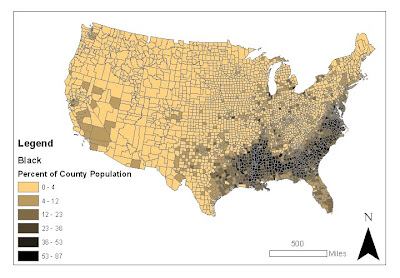
Percentage of Black People by County


(click to enlarge)


This map shows the percentage of black people living in each county in the United States in 2000. The percentage is calculated by the number of black people in a county divided by the total number of people in that county. One major pattern is that there tends to be a higher percentage of black people living in the Southern states. There is also a slightly higher percentage in California than in many of the mid-western and northern states.
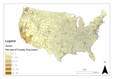

Percentage of Asian People by County


(click to enlarge)


This map shows the percentage of asian people living in each county in the United States in 2000. The percentage is calculated by the number of asian people in a county divided by the total number of people in that county. One major trend is that there tends to be a higher percentage of asian people living in coastal states. California and Washington have quite high percentages, and there is also a concentration in New York and Maryland.
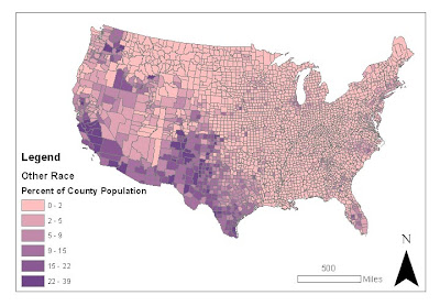

Percentage of Other Races by County


(click to enlarge)


This map shows the percentage of "other race" people living in each county in the United States in 2000. The percentage is calculated by the number of "other race" people in a county divided by the total number of people in that county. A major pattern is that there tends to be a higher percentage of "other race" people living in states that border Mexico, as well as in Washington. It would make sense if "other race" includes Latinos, as it is known that there are high percentages of Hispanic and Latino Americans living in California, Texas, and New Mexico.


Concluding Discussion of Census Maps:

The census maps reveal rather clear patterns of where people of certain races tend to live. For the map of African Americans, especially, there is a clearly defined area of higher percentages of black people. I believe these maps reveal the racial segregation that occurs in the United States, either voluntarily by where people choose to live, or caused by societal pressures. If some degree of racial segregation was not occurring, these clear patterns would not emerge. Overall, the data was interesting to look at. I just hope that these patterns can be attributed to voluntary actions, and the general tendency of people within the same ethnic group to live together, rather than with those of a different ethnic group. With the differing economic success of various areas, however, it seems that there are other unfortunate factors at play.


My Overall Impressions of GIS:

GIS is obviously a powerful tool with many applications across various fields. With GIS, it is quite easy to take raw data and turn it into a clear, concise, and stylish map. I was impressed by the interface for choosing intervals for the categories and colors; it was very customizable. Since you can even make 3D graphics in ArcScene, the program seems extremely versatile. GIS can be used for spatial analysis (to get results for your study) and producing graphics (to display those results). In this way, it is a very useful device for scientists, who can complete two parts of their scientific research with one program. I'm glad I had the opportunity to work with ArcGIS, because I may use this powerful tool to conduct spatial analysis and present results in future jobs. It is quite relevant to any kind of environmental spatial analysis, such as examining which areas are impacted by pollution, finding good sites for wind-mills or solar power plants, or defining the range of endangered animals.

Thursday, May 20, 2010

Lab 7 (week 8)


(click for a larger view)


The Station Fire’s Effects on Nearby Residential Areas and Structures:

Although the Station Fire started within the Angeles National Forest, it quickly grew larger and spread into an out of control wildfire. For a while, the firefighters stated that they only had the fire 5% contained, meaning that it was nearly impossible to control where the fire was spreading to. Fortunately, the blaze was eventually brought under control, and caused only two deaths. Property damage was not very extensive, considering the size of the blaze.

The Station Fire became a threat to nearby populated areas. The second map shows how the fire spread to overlap parts of densely populated, residential zones. The firefighters attempted to set up fire breaks as a defense against the fire spreading to nearby homes. However, they were not entirely successful. The fire was extremely difficult to contain, and raged out of control for a while. Eighty nine homes were destroyed, and thirteen were damaged.

The fire also threatened commercial property. The fire burned on the slopes of Mount Wilson, where over twenty four television, cellphone, and radio towers are. Also at the top of the mountain is a historic solar observatory, worth over $20 million. The observatory is used by UCLA, USC, UC Berkeley, and Georgia State University, so it would affect many researchers if it were destroyed. There was much concern over the expensive equipment in the observatories (which could not be moved easily), but the firefighters’ efforts to protect the area were successful. Only two communication sites were destroyed.

Several roads were closed due to the station fire, likely interfering with the daily life of residents in the area. Perhaps the most notable closure was the Angeles Crest Highway, which runs directly through the center of the fire’s area, and is usually used by 11,300 motorists each day. Eleven other roads were closed for the fire’s duration. Also, many residents had to be evacuated in ares such as Juniper Hills, La Crescenta, La Canada Flintridge, Altadena, Tujunga, Glendale, and Sunland.

Large fires like the Station Fire in California are an unfortunate result of historic fire suppression. The mediterranean climate has many natural fires, which the native flora are adapted to, or even dependent on. Since European settlement, natural fires have not been allowed to gradually burn up the “fuel” of plant litter that accumulates on forest floors. The result is that when fires do occur and get out of hand, they become large crown fires which kill trees that would otherwise survive them. Disrupting the natural system of small, frequent fires has created a hazard to the environment and to the residents of California.

References:

"20 Largest California Wildland Fires (By Acreage Burned)". California Department of Forestry and Fire Protection. September 3, 2009. http://www.fire.ca.gov/communications/downloads/fact_sheets/20LACRES.pdf

Knoll, Corina. “TV, cellphone signals from Mt. Wilson at risk.” Los Angeles Times. 31 August 2009. http://articles.latimes.com/2009/aug/31/local/me-fire-mount-wilson31

"Station Fire Evening Update Aug. 31, 2009". InciWeb (United States Forest Service). August 31, 2009. http://inciweb.org/incident/article/9360/

“Station Fire Update Sept. 27, 2009”. InciWeb. September 27, 2009. http://inciweb.org/incident/article/9640/

Weikel, Dan. “Angeles Crest Highway closed indefinitely because of fire”. Los Angeles Times. 4 September 2009. http://latimesblogs.latimes.com/lanow/2009/09/angeles-crest-highway-closed-indefinitely-because-of-fire.html

Friday, May 14, 2010

Lab 6 (week 7)

1. My selected area is the San Francisco bay area. It is in Northern California, and my area of interest encompasses the bay, peninsulas, and some of the deltas and rivers leading up to the bay. I chose this area because I know California has very interesting topography, and I was also curious how the elevation models would look with an area of water. Also, of course, the bay area came to mind because I grew up there.

Extent Information:
Top: 38.2847222216
Left: -122.774166667
Right: -121.373055555
Bottom: 37.2574999993

Spatial Reference: GCS_North_American_1983 (D_North_American_1983 Datum)

2. Shaded Relief Model (click images for a larger view)


3. Slope Map


4. Aspect Map


5. 3D Image

Friday, May 7, 2010

Lab 5 (week 6)


(click the image for a larger view)

To answer the perhaps rhetorical questions in the lab guide: The equator spans about 24,948 miles. The Northern and Southern-most graticule lines also span about 24,948 miles, but they represent the North and South poles (single points).
Alaska and Greenland are not really bigger than Brazil. Their areas are distorted by the Mercator projection, since the Mercator projection is a conformal projection which preserves shape and direction. The distance between Washington, D.C. and Kabul with the Mercator projection is about 10,093 miles.

Why Map Projections are Important:

Map projections are important for several reasons. They distort the world’s surface, and can significantly change distance, area, and direction. This is especially relevant when taking measurements for scientific studies or other projects. Map projections are a convenience because they make geographic data easier to work with, in spite of distorting it. Map projections can even affect the way we perceive the world.

Perhaps the most obvious significance of map projections is how they distort the Earth. In order for the three dimensional, spherical surface of the earth to be converted to the two dimensional, flat surface of a map, either distance, area, or shape (or all three, to varying extents) must be compromised. The six map projections shown above are a good example of different types of compromises. The measured distance from Washington, D.C. is significantly inaccurate in all of the projections except for the equidistant ones, which were specifically created to preserve distances. Other types of distortion are obvious, such as the enormous size of Antarctica in the Mercator projection, and the warped angles in the Bonne projection. Scientists must take care to select a map projection which preserves features most critical to their study interest.

So, why use map projections at all if they cause distortions? The reasons were more pertinent in past times. The only practical way to represent the Earth was on paper, a flat medium. Projections were necessary to translate the Earth onto a plane which is much easier to work with. Three dimensional globes are an option, but they have several drawbacks: they are costly to make, difficult to transport and work with, and unless you use immense resources to make a giant globe, their scale is rather limited. Now, with computers, storage of three dimensional data is possible, but takes more memory, software, and computing power. Also, while two dimensional data can be printed onto a page, there is currently no easy way to transfer three dimensional data from a computer into the real world.

From personal experience, I would argue that map projections have the ability to alter how humans perceive the Earth. For example, the map projections I am most used to seeing is the Robinson map projection. I remember being confused the first time I saw a polar stereographic projection of Antarctica, showing it accurately as a rather small, round land-mass. In the Robinson projection, Antarctica is enlarged and stretched out so that it looks like a very long continent. In fact, nobody seems to care about Antarctica, since it is almost always grossly distorted in map projections (it is infinitely large in the Mercator projection, and stretched all the way around 360° of the map in the Equidistant Conic and Behrmann projections). Also, because of how the Robinson map projection is centered at the Prime Meridian, I used to forget that Alaska was so close to Asia. I believe it perplexed me the first time I heard about the theoretical former ice bridge between the two continents, since they seemed so far away. Fortunately, my misconceptions were easily corrected at a young age. However, it takes looking at several different map projections, or a globe, to gain an accurate understanding of the Earth’s structure.

Followers

Contributors