Ilona Chadwick's blog for Geography

Thursday, April 22, 2010

Lab 4


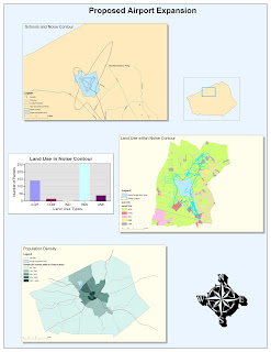
(Click on the map above to see a larger version.)

My experience with ArcGIS was somewhat time-consuming and frustrating (as expected when getting familiar with new software), but overall it was rewarding. The tutorial was very detailed, so I never really had a moment where I thought, "what do I do now?". The main problem I had was with referencing files from the correct drive. I ended up using several drives (my flash drive, the local workspace, and the shared server where the data originally came from) because there was an error where it would not let me select files on my flash drive. I eventually had to just re-do one section, but fortunately it was faster the second time, and gave me some more practice. I did have some fun in the end while customizing the color scheme and layout of my map. Overall, I can tell that this software has a lot of potential for creating and editing maps and data, and presenting them in various ways.

I believe that both the main potential and pitfall of ArcGIS lies in its complexity. It reminds me of Adobe Photoshop, which I have been using for years. There are a lot of features and a lot of options, and it would take a lot of time and effort to fully utilize all of them. In general, though, the basic functionalities and some of the more straightforward customizations of both ArcGIS and Photoshop are not too difficult to master. So, although ArcGIS is intimidating because it can do so much, I don't think it will be too difficult to make some basic maps with it. It will just be a matter of learning all of the sequences and pathways to accomplish certain tasks.

I think that another potential pitfall of ArcGIS is that it is susceptible to common computer problems and difficulties, such as crashes, misplaced files, and lack of writing permissions on certain drives. I also think that some of my difficulties were partially due to how I normally use Macintosh operating system instead of Windows. One main difference between the Mac and Windows operating systems is that Windows is very heavily reliant on the "path" or "address" of files (Ex. S:\Data\Classes\Geog\Spring2010\Week 4), while Mac is not. With Mac, I can move a file around and even rename it while the file is open, and it will not cause any issues. With Windows, you cannot do that, so I have to get used to paying more attention to where files are, in order to avoid mistakes like the one I made of referencing files in my map from different drives.

It is quite clear that ArcGIS has a lot of potential. The presentation at the beginning of lab section demonstrated some of the quite impressive maps and charts the program can produce. I was especially intrigued by the 3-dimensional elevation map of a mountain range, since I thought ArcGIS only functioned in 2 dimensions. I'm sure 3-D files will be more difficult to work with, but the results do tend to be more interesting. I am also interested in exploring all of the different visual options in ArcGIS, such as changing color-schemes and layouts.

Thursday, April 15, 2010

Lab 3


View Vae Victae Member Locations in a larger map

A Description of my map:

This map shows where members of the World of Warcraft guild (a group of friends who play the video game together) "Vae Victae" are located (only those who have volunteered their information). The locations are by state and city, and each member is labeled by their in-game character name. The description includes a picture and brief description of their character.


The Pitfalls, Potential, and Consequences of Neogeography:

The potential of neogeography is clear. Websites like Google Maps make it easy for average computer-users to create maps for many useful purposes, perhaps most notably, navigation. Personally, I used google maps just a few weeks ago to plan out a visit to San Francisco (locate the notable sights, find a restaurant, etc.). Average users can also use maps creatively, like in this project, to make themed maps and display information spatially. More advanced users can make dynamic maps or more advanced mashups, such as a spatial tracking system for airplanes. I believe that more data will be added to Google Maps until it basically becomes a tool to locate anything, and to view satellite images of any place in the world. When that happens, we will have a publicly accessible map of the world, which anyone can reference and combine with other information to create interesting spatial databases, like Flickr’s photo locator.

There are also potential pitfalls and consequences to making spatial data public. Some have voiced fears for public safety due to the information. For example, criminals and terrorists can use satellite images to accurately plan out attacks or robberies. These fears may be over-stated, since it the images do not provide tactically useful information about the interiors of buildings, and the same information could be gathered by the offenders traveling to the area. There are also concerns about privacy, especially as satellite and street-view images become more detailed and high quality. Is it “too much” detail when you can see and recognize people on the street? What if someone is ashamed of visiting a particular place, but they got photographed at that location by Google? What if someone was photographed through a large window in their house? There is significant danger of privacy violation when the images are made public.

Thursday, April 8, 2010

Lab 2

1. What is the name of the quadrangle?
The map is called “Beverly Hills Quadrangle California – Los Angeles Co.”

2. What are the names of the adjacent quadrangles?
The adjacent quadrangles are Canoga Park, Van Nuys, Burbank, Topanga, Hollywood, Venice, and Inglewood.

3. When was the quadrangle first created?
The quadrangle was first compiled in 1966.

4. What datum was used to create your map?
The North American Datum of 1927 and the North American Datum of 1983 were used.

5. What is the scale of the map?
The scale is 1:24,000.

6. At the above scale, answer the following:
a) 5 centimeters on the map is equivalent to how many meters on the ground?
5 cm / 100 = .05 m
.05 m x 24,000 = 1200 m

b) 5 inches on the map is equivalent to how many miles on the ground?
5 in x 24,000 = 120,000 in
120,000 in / 63,360 in/mi = 1.8939 miles

c) one mile on the ground is equivalent to how many inches on the map?
1 mile / 24,000 = 1/24,000 mi
1/24,000 x 63,360 in/mi = 2.64 inches

d) three kilometers on the ground is equivalent to how many centimeters on the map?
3 km / 24,000 = .000125 km
.000125 km x 100,000 cm/km = 12.5 cm

6. What is the contour interval on your map?
The contour interval is 20 feet.

8. What are the approximate geographic coordinates in both degrees/minutes/seconds and decimal degrees of:
a) The Public Affairs Building is at about 37°04'26"N, 118°26'20"W, or 37.074°N, 118.336°W.

b) The tip of Santa Monica pier is at about 34°00'28"N, 118°29'58"W, or 34.008°N, 118.499°W.

c) The Upper Franklin Canyon Reservoir is at about 34°07'10"N, 118°24'37"W, or 34.1195°N, 118.410°W.

9. What is the approximate elevation in both feet and meters of:
a) Greystone Mansion (in Greystone Park) is at about 600 feet, or 182.88 meters.

b) Woodlawn Cemetery is at about 140 feet, or 42.672 meters.

c) Crestwood Hills Park is at about 600 feet, or 182.88 meters.

10. What is the UTM zone of the map?
The UTM zone is 11.

11. What are the UTM coordinates for the lower left corner of your map?
The UTM coordinates are 3,763,000mN and 361,500mE.

12. How many square meters are contained within each cell (square) of the UTM gridlines?
Each grid cell contains 1,000 x 1,000 = 1,000,000 square meters.

13. Obtain elevation measurements, from west to east along the UTM northing 3771000, where the eastings of the UTM grid intersect the northing. Create an elevation profile using these measurements in Excel (hint: create a line chart). Figure out how to label the elevation values to the two measurements on campus. Insert your elevation profile as a graphic in your blog.


14. What is the magnetic declination of the map?
The map is declined 14 degrees per 249 miles from MN.

15. In which direction does water flow in the intermittent stream between the 405 freeway and Stone Canyon Reservoir?
Water flows from North to South.

16. Crop out (i.e., cut and paste) UCLA from the map and include it as a graphic on your blog.

Thursday, April 1, 2010

Lab 1


Source: http://www.flickr.com/photos/masck/295040261

I found this map on someone's flickr account. It is a map of the United States, with each state represented by a cut-out of a license plate from that state. I found it intriguing that the artist chose such an unconventional media, and it makes for a bold and colorful visual effect.


Photo

Source: Spiegel Online

I found this image on someone's blog with a link to the original source. It is a map of the world, color-coded by the majority religion in each area. I found it interesting as it relates a more social study (that of religion) with geography. I can imagine the types of correlation between location and majority religion that can be deduced from this map. For example, why is there a "pocket" of Mormons in the mid-western United States? Are they descendants of an original migrant group who insulated themselves from the Christianity all around?


Source: Strange Maps

I found this map on a blog aptly named "Strange Maps." It is a map/political cartoon of Europe in 1870. The blog has a detailed description of the symbolism of each country's "character" in the map. In short, the interactions between the characters parallel the political tensions and interactions occurring at the time. One amusing depiction is England, an old lady struggling to maintain control of her "lap dog," Scotland. I found this map to be a nice union between a geographic map and a satire of international political tensions. The artist conveyed their message in a clever, amusing manner.

Followers

Contributors